Pantone Colors and Wall Trends for 2025
As a New York-based interior designer, I like to think I’m always “in the know” as to the newest, most compelling trends that affect the world of home design and interior design. To that point (and unexpectedly), I came across an article published across the pond (on the BBC website to be precise) to see what colors are considered to be the “it” colors of 2025. Yes, it’s that time of year again. You see, the right colors can truly be transformative for a home. It’s not just about aesthetics—colors influence the way we feel, the energy of a space, and even how we perceive a room’s size and purpose. So I wanted to dedicate some time to that in this new article. Whether you’re updating a Brooklyn brownstone or a sleek Manhattan loft, the right hues can raise an interior from functional to fabulous.
I will get to what the BBC reported on the trending color(s) in a moment. But first, in 2025, I want to note that wall design trends go beyond just paint. Textures, wall coverings, and mixed materials are stepping into the spotlight. In this article, I want to share with you a bit of my thinking of paint colors (and wall finishes) and hope it can guide you to create a cohesive and stunning environment. Let’s look at this room by room.

Pantone Colors to Live and Work By
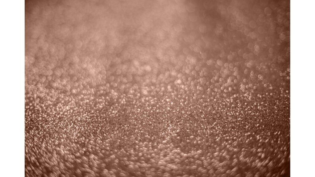
OK, here’s the big reveal: The Pantone Color Institute™, a consulting segment within Pantone (you know the strips of paper you get at paint shops with colors?) gives an annual forecast on global color trends. They have announced the 2025 color of the year as….mocha mousse!
Incorporating these colors into your wall design can be achieved through various techniques, including painting accent walls to enhance a room's aesthetics.
(As an aside, the Institute also advises companies on Pantone colors for brand identity and product development as a way to consider the application and integration of color as a “strategic asset.” FYI: Here's the BBC article announcing the 2025 Pantone colors.)
Living Rooms: Colorful Places to Relax and Entertain
Let’s start with some ideas for using color in various rooms. First, the living room. Often the heart of any home, its design sets the tone for your entire space.
So in 2025, let’s go with warm and earthy tones like yes, Mocha Mousse! I’m adding in terracotta brown as another consideration. These colors provide a grounding atmosphere, serving as a versatile backdrop for bold furniture or layered textures.
Also, consider using textured plaster for an accent wall to add dimension, or incorporate wood paneling painted in a muted shade of forest green to bring a touch of biophilic design into your living room.
Consider using a decorative frame to highlight wall art, enhancing the overall aesthetic and adding a structured element to your design.
Here’s a Bold Tip: Pair a deep classic navy accent wall with warm beige on adjacent walls for a dramatic yet balanced effect. You can even add velvet or boucle furniture in jewel tones for extra flair.
Kitchens and Dining Areas: Smorgasbord of Color
Kitchens are no longer utilitarian spaces—they’re hubs of creativity and connection. Paint colors like sunny mustard or warm terracotta can energize the space, making meal prep feel invigorating. In dining areas, embrace drama with deep plum or go bold with an eclectic maximalist wall treatment featuring patterned wallpaper or murals. To tie these bold looks together, use complementary trim colors like classic white or charcoal gray.
Functional Touch: In kitchens, consider a washable paint finish like satin or semi-gloss for easy maintenance. Add a backsplash with materials like reclaimed wood or glass tiles to integrate texture with your color scheme. And remember, if you have vintage pieces or wonderful finds from your travels, consider using those as well. You may recall I have a lovely koi fish backsplash in my Brooklyn Brownstone that I adore and will treasure forever.
Bedrooms: Sanctuary of Calm
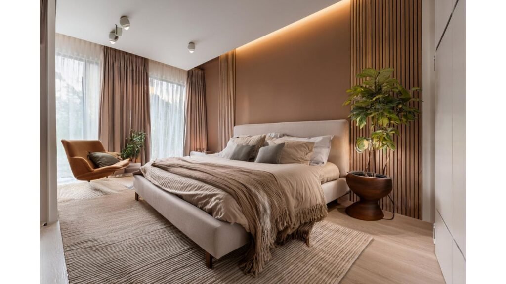
Bedrooms call for serene and comforting colors that promote rest and relaxation. Shades like mocha mousse, dusty rose, muted teal, and soft yellow ochre are ideal for crafting a soothing environment.
If you’re designing a child’s bedroom, consider a two-tone wall treatment with soft yellow on the upper half and a neutral beige on the bottom half for a playful yet timeless look. For adult bedrooms, Japanese Minimalism can be achieved with subtle textures using limewash paint in soft hues like pale gray-green, or even richer ones such as avocado, deep moss, or olive green. (I think these can work in the living room too.)
Enhance the Mood: Introduce an upholstered headboard or textured fabric panels to complement your chosen wall color, making the bedroom feel more luxurious.
Bathrooms: Spa-Like Retreats
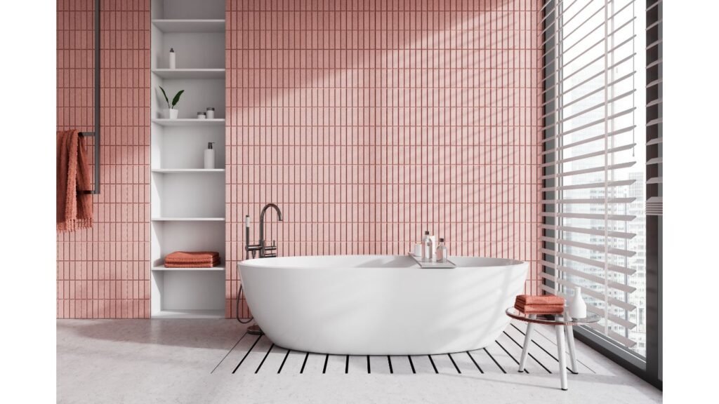
Bathrooms are seriously where functionality meets luxury. Trending shades like muted teal and soft yellow (warm, golden yellows) help create a refreshing spa vibe. For smaller bathrooms, consider using warm beige or pale pink (not like those pink bathrooms from the 1950s or 60s, however) to visually expand the space while adding warmth.
For texture, ceramic or natural stone tiles can be painted with a matte finish to achieve a harmonious look. Incorporate accents like brass fixtures or vintage mirrors to complete the design.
Here’s a Design Tip: Use biophilic design elements like greenery or pebble-textured tiles to make the space feel more organic and serene. Nature belongs throughout the home.)
Offices and Creative Spaces: Energize and Focus
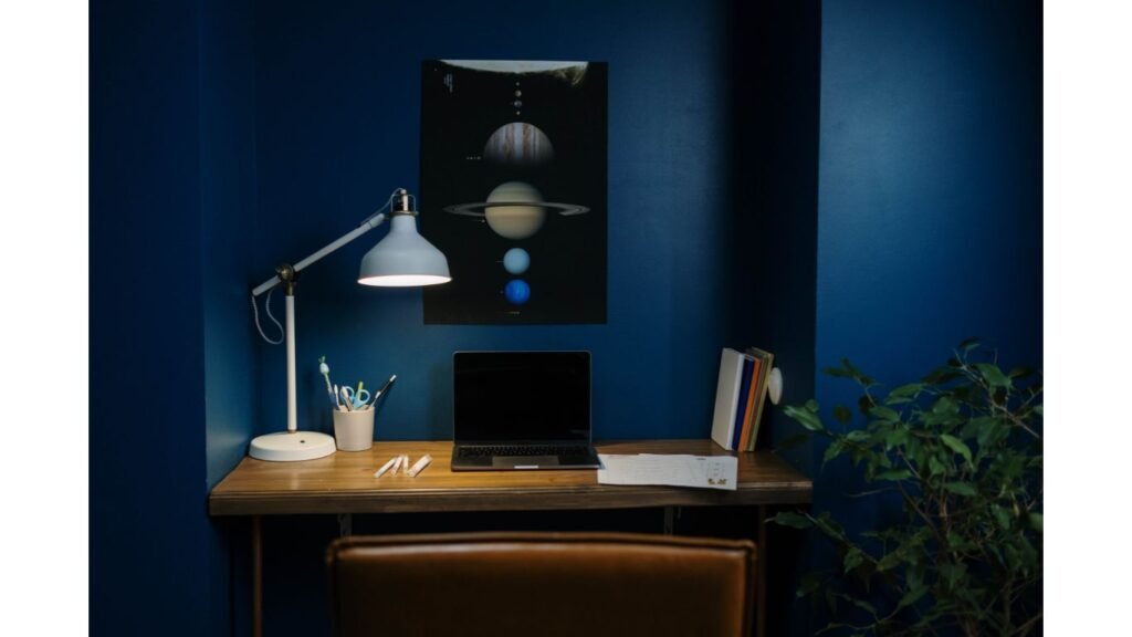
As you know, we often offer interior design ideas for home offices. And so, your choice of color can significantly impact productivity and creativity. Opt for forest green to foster concentration or classic navy for a sophisticated, distraction-free zone.
Want to spark innovation? Try dusty rose paired with textured fabric wall panels for warmth and inspiration. If you’re working with a smaller apartment office nook, use lighter hues like soft yellow to maximize light and space. I keep thinking of spaces that I work at in Manhattan and Brooklyn, and many of these ideas work well. But really, this can work in many different types of homes and apartments in different locales.)
Pro Tip: Add a corkboard wall or magnetic paint for functionality without compromising on design.
Hallways and Entryways: First Impressions and Transitions Matter
Hallways and entryways often go overlooked, but they’re prime opportunities to set the tone for your home. Deep plum or maximalist patterns make striking first impressions in these transitional spaces. To keep things fresh and contemporary, use textured wallpapers with subtle metallic elements.
For narrow hallways, lighter tones (light burgundy…or a lighter mocha?) can create a sense of openness. Pair them with a runner rug in bold patterns to make the area feel curated yet inviting.
Added Flair: Consider wainscoting painted in a contrasting color to elevate a simple hallway.
Wall Art Trends in 2025
As we look to the future, wall art trends in 2025 are expected to be bold and vibrant. Pantone colors will continue to play a significant role in wall art trends, with a focus on bright and bold shades. To stay on-trend, consider incorporating Pantone colors into your wall art through prints, paintings, or other forms of wall decor. You can also experiment with different shades and combinations to create a unique and stylish look.
(I hope this helps! Let me know if you need any further assistance on art ideas.)
Alternative Wall Surfaces: Going Beyond Paint
Paint is just the beginning. Wall finishes in 2025 are exploring alternative surfaces that add texture and intrigue:
- Plaster Finishes: Create an Old-World, artisanal aesthetic with Venetian plaster in muted, earthy tones.
- Fabric Panels: Great for bedrooms or offices, these add a touch of luxury while improving acoustics.
- Wood Paneling: Vertical slats or geometric patterns painted in bold hues like navy or terracotta add depth to any space.
- Metallic Accents: Incorporate metallic paint or panels in silver, bronze, or gold to give a touch of glamour. (We are going to get into other surface materials in another article soon – stay tuned!)
Combining Trends for a Cohesive Look
While it’s tempting to embrace every trend, the key is finding harmony within your space. Here’s how:
- Stick to a cohesive palette. For example, if you’re using forest green in the living room, consider softer greens or warm neutrals in connecting rooms.
- Balance bold choices with neutrals. If you go for deep plum in the dining room, pair it with warm beige or textured white in adjacent spaces to avoid visual fatigue.
- Mix textures strategically. Combine painted walls with other surfaces like wood, stone, or plaster to add depth and variety.
Sustainability in Wall Design
As a New York interior designer, I’m aware of how paint can be something to consider in terms of air quality. I work hard to prioritize sustainability in every project. When choosing paints, opt for low-VOC or eco-friendly options to reduce environmental impact. Similarly, reclaimed wood paneling or natural limewash paints are excellent choices for creating sustainable, stylish spaces. Lastly, handcrafted wall treatments, like artisanal plaster or bespoke wallpapers, not only support small businesses that create such unique materials but also add a layer of authenticity to your home.
Final Thoughts: Designing for 2025 with Pantone Colors...and More
Your walls are more than just a backdrop—they’re the canvas for your creativity, personality, and lifestyle. I’ve seen how these choices transform not just spaces but the way people feel in their homes. So, by incorporating trending colors like mocha mousse or deep plum, exploring textures with plaster or wood, and integrating sustainable practices, you can create a living environment that feels uniquely yours. Whether you’re updating a cozy Brooklyn apartment or reimagining a Manhattan loft, 2025 is the year to take bold steps and embrace designs that reflect your vision.
If you want a bit more inspiration and thinking around color, check out my article about our Purple House Project. Would love your thoughts on this.
Cheers!


